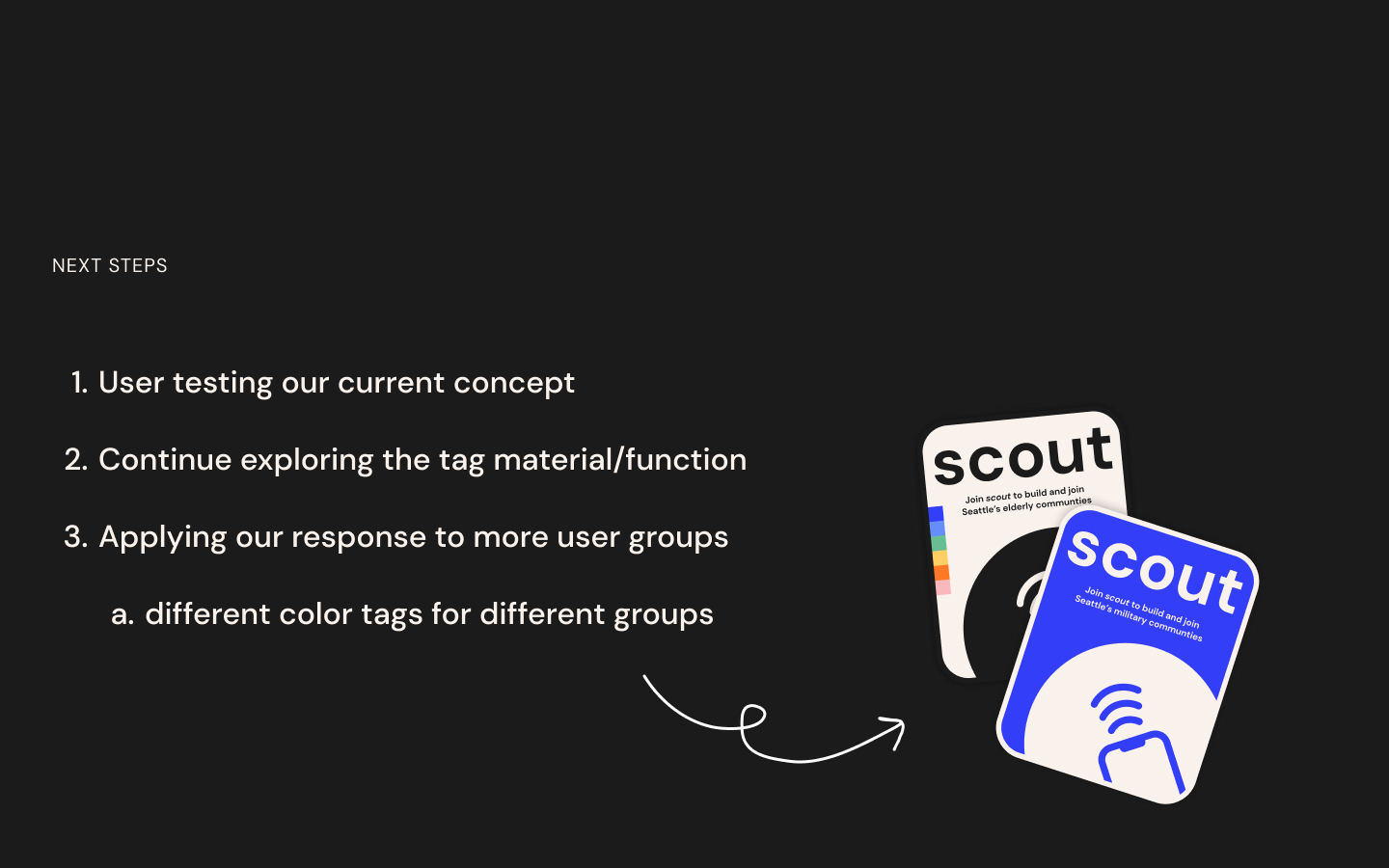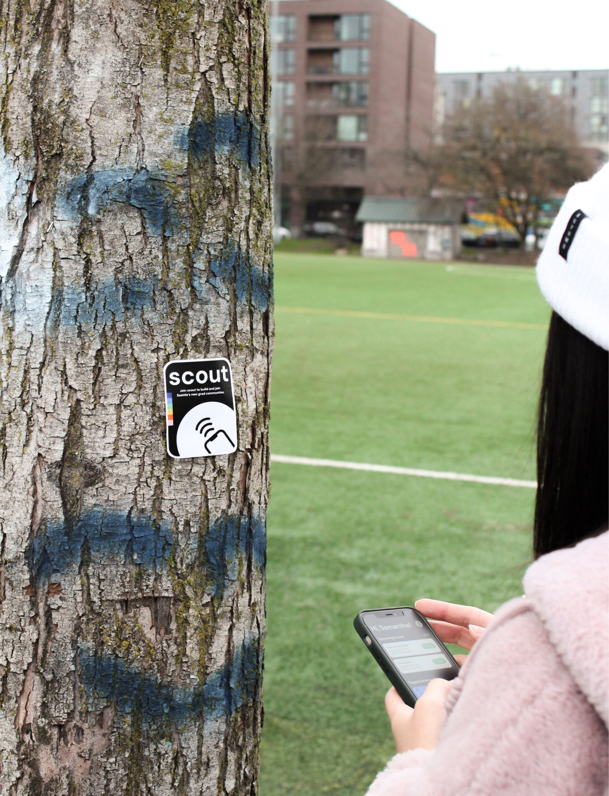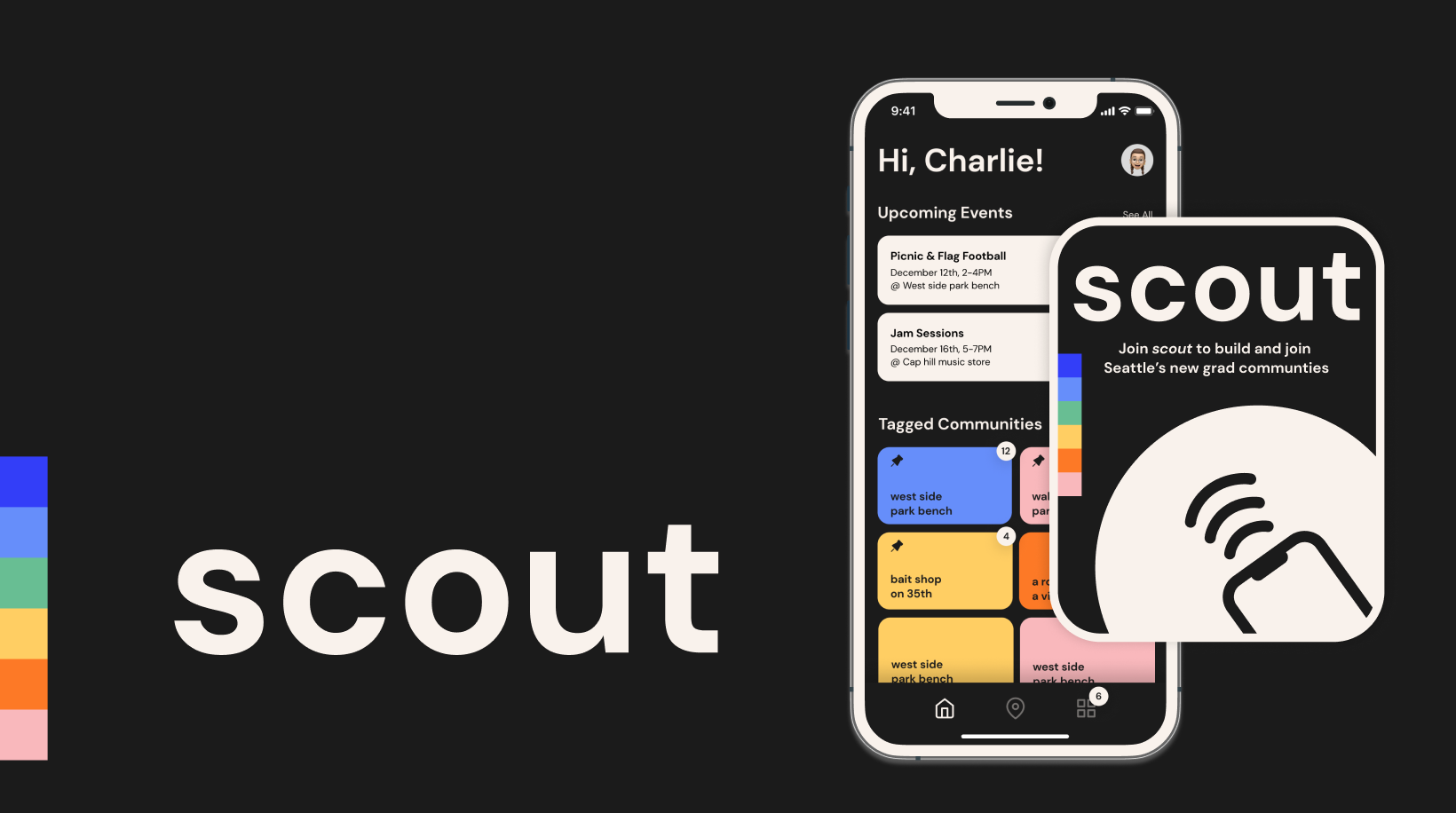
scout
a physical, location tagging system for new grads to meet each other in the city through individual exploration. Find and save tags posted around the city, and meet others who value the same locations.
Timeline: Autumn 2021 - 10 weeks
Role: Design research & UX/UI design
Team: Gwenna Gram, Joanne Chen, Brayan jimenez, Alvin Jeong
Task
Over 70% of new college graduates plan to move to a new city post-graduation according to the Huff Post. This becomes a new transitional stage in other words, a new chapter in recent grads life balancing professional work and adjusting to a new city. Therefore, a question that came to mind is, "How might we foster an organic environment for relocated grads in a new city to explore and engage in communities catered to their interests and circumstances?"
Solution
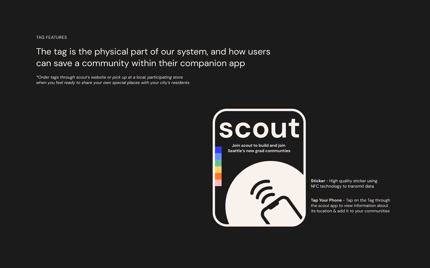
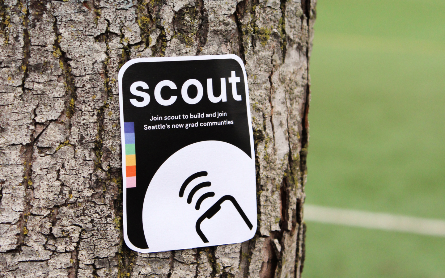
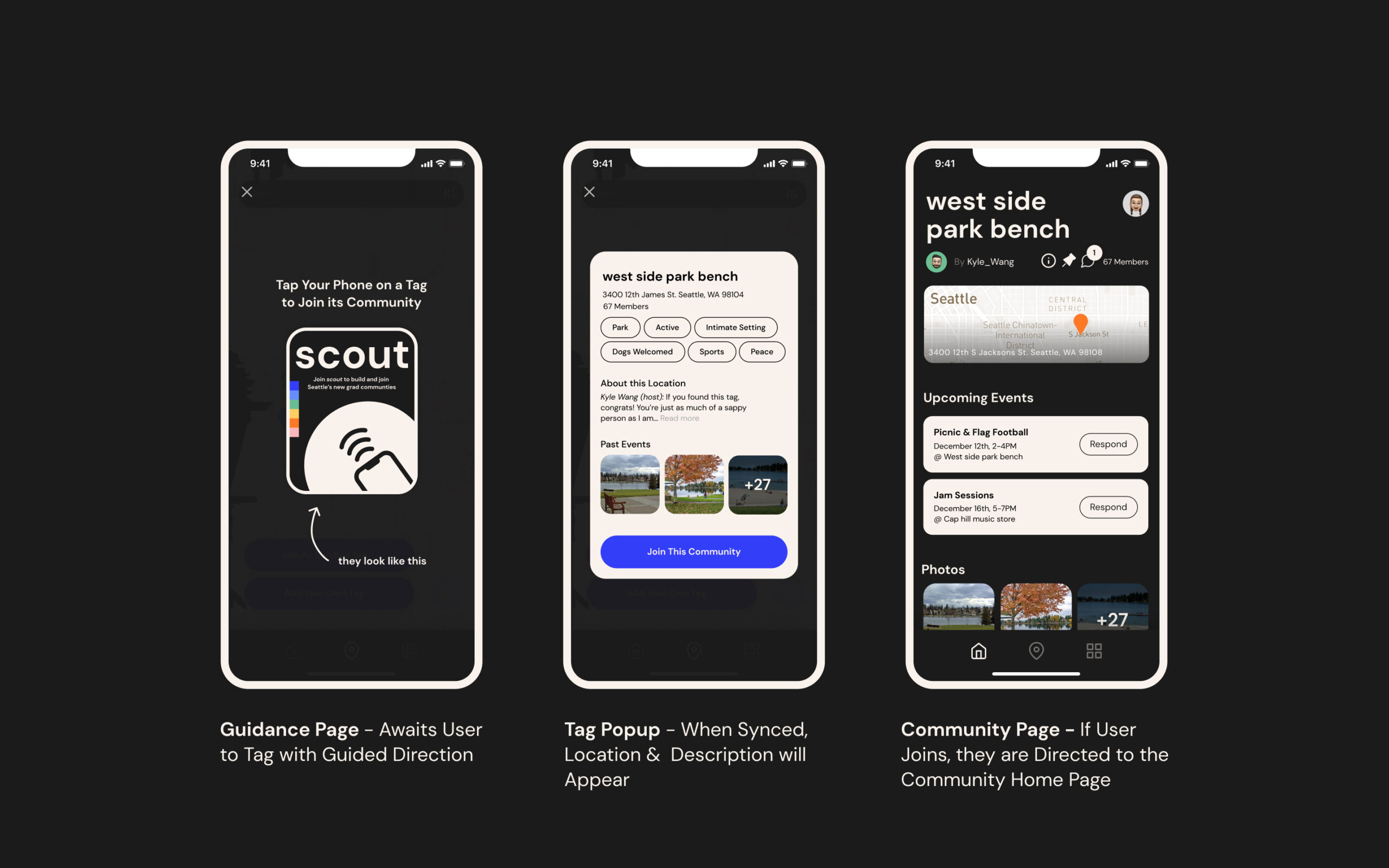
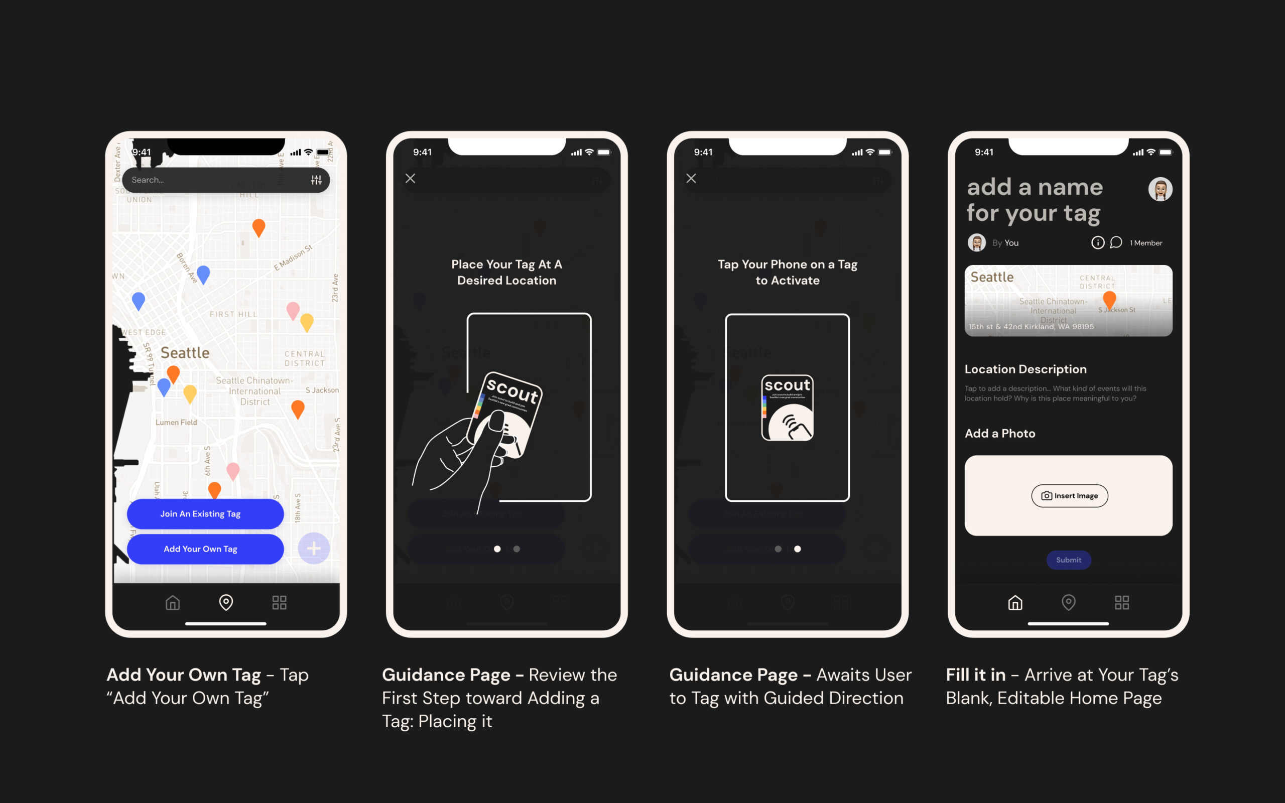
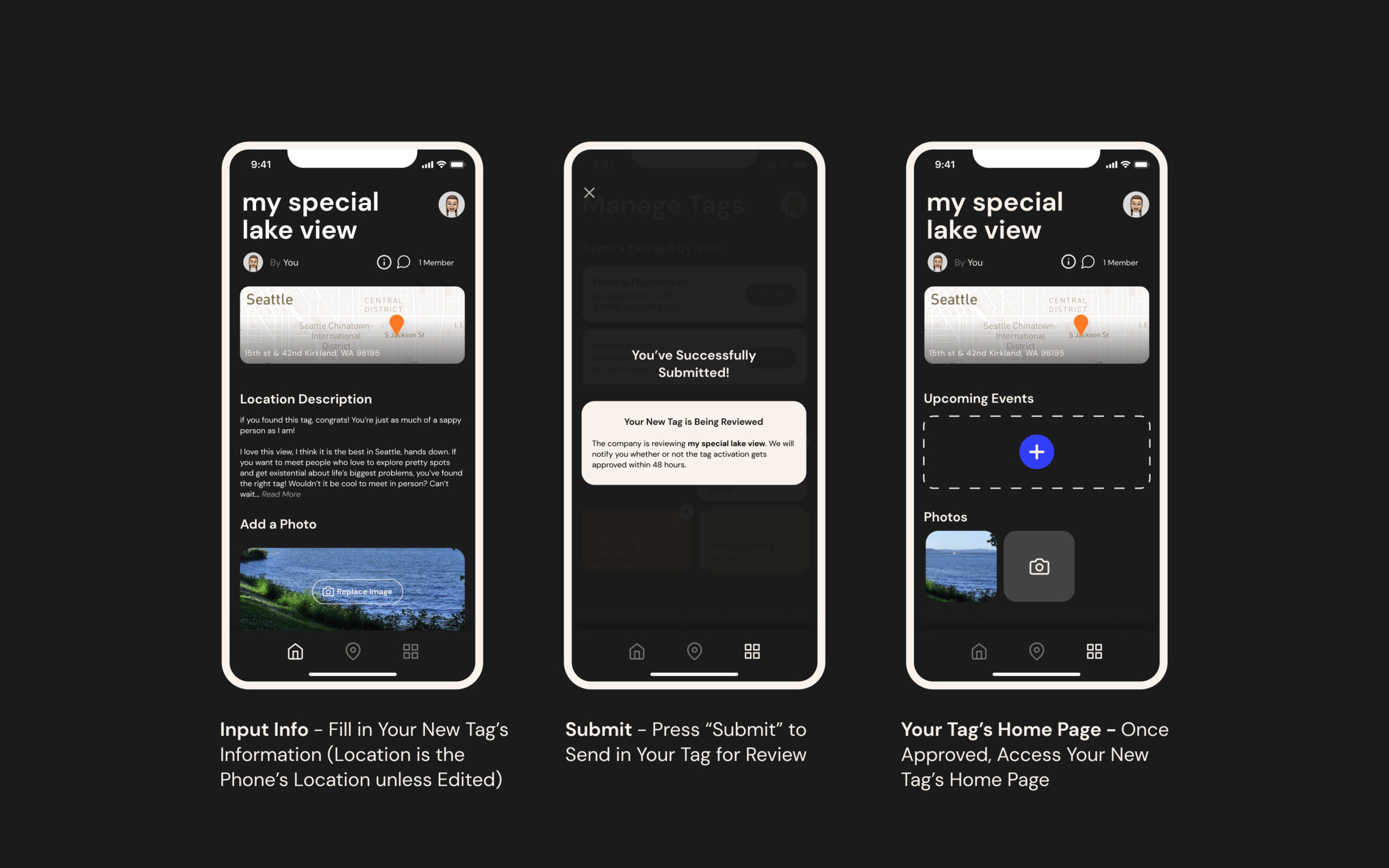
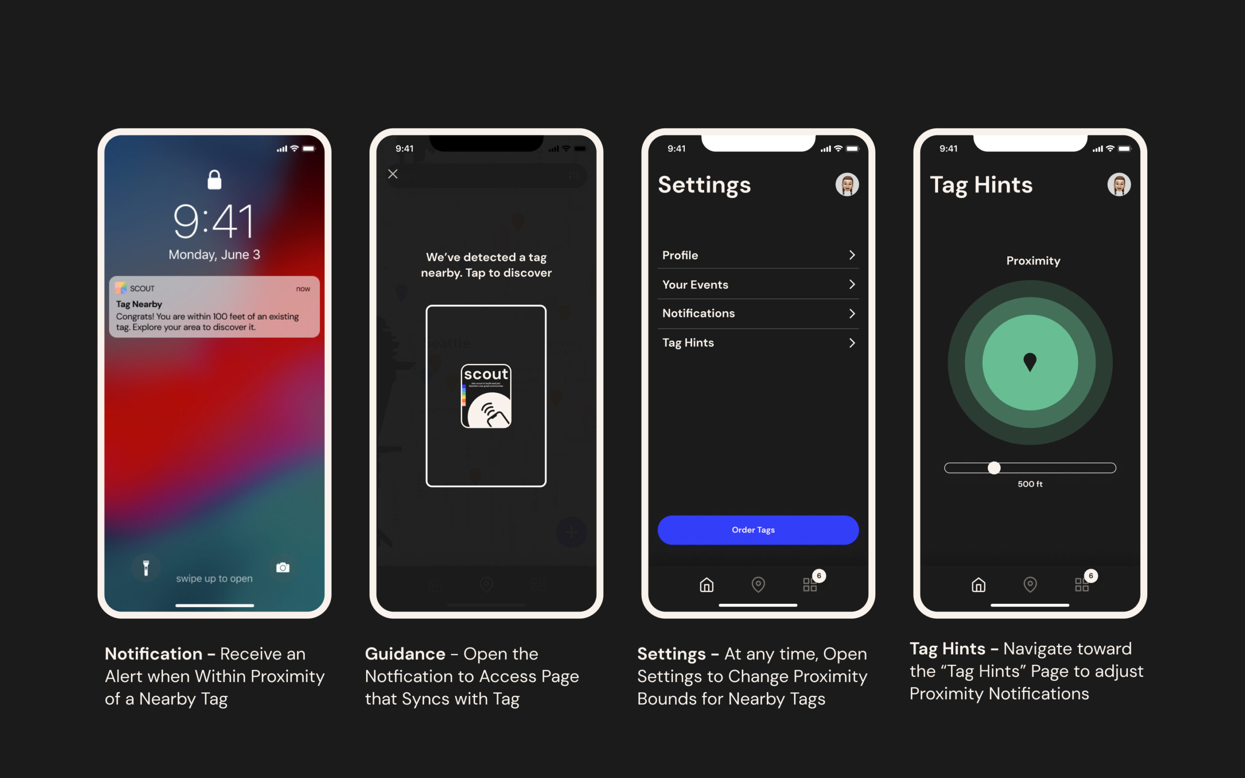
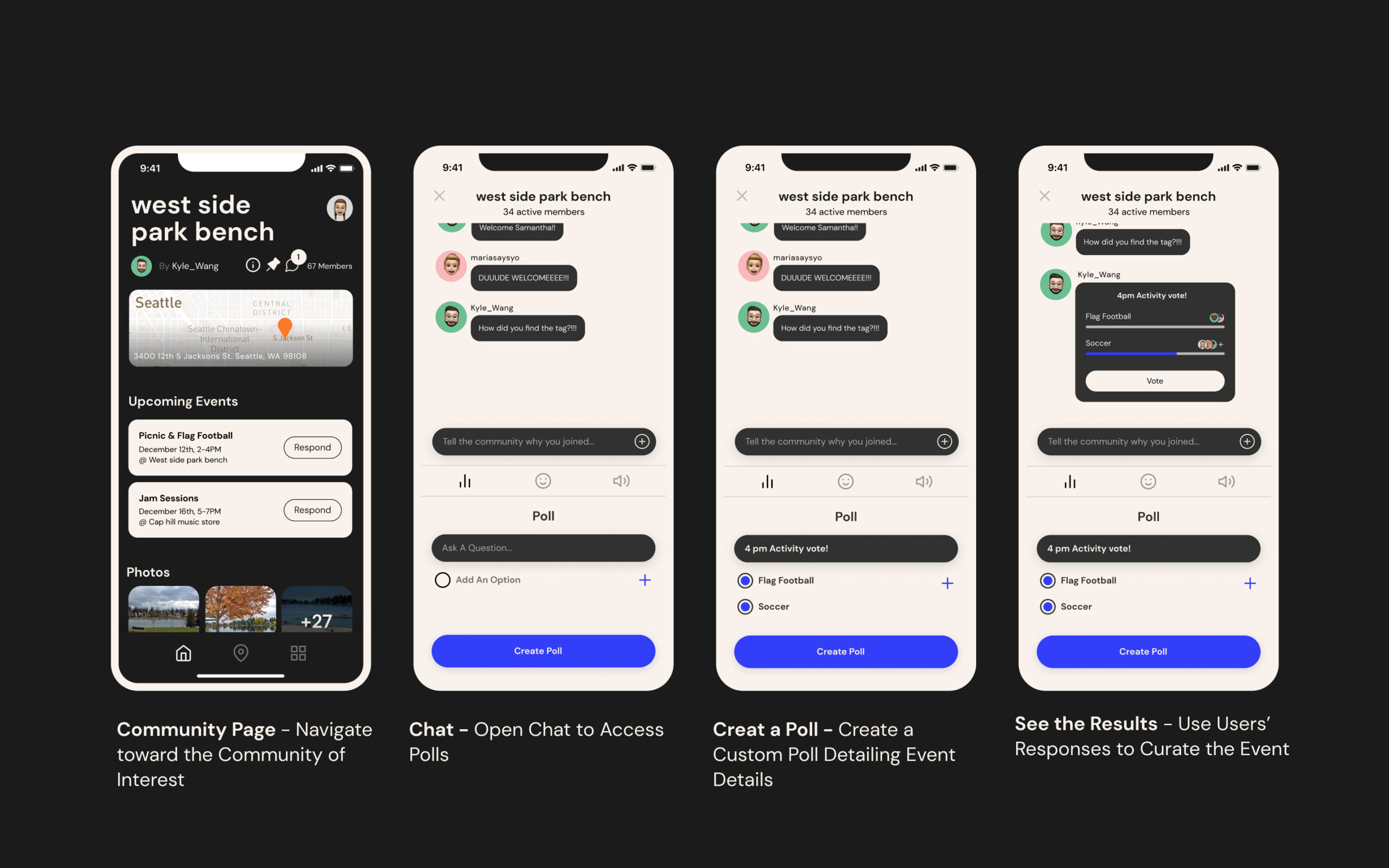
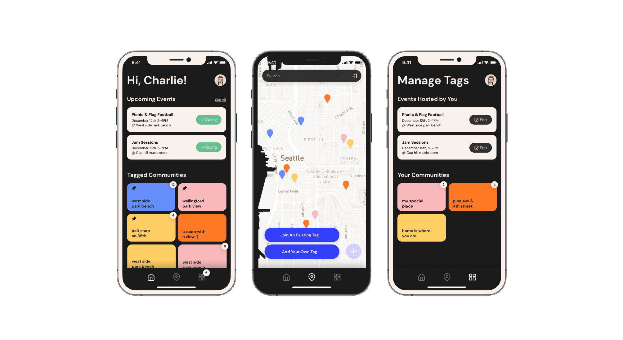
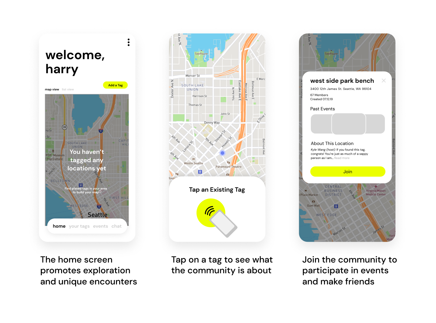
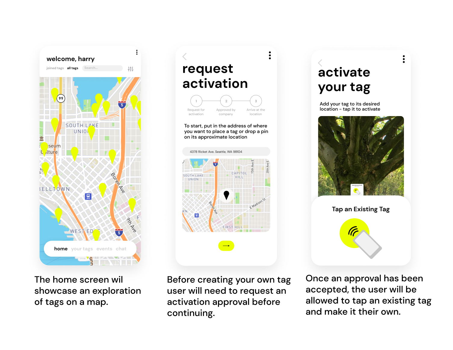
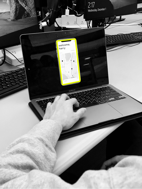
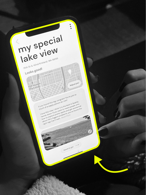
A physical, location tagging system for new grads to meet each other in the city through individual exploration. They can find and save tags posted around the city, and meet others who value the same locations. Scout has two components: the physical NFC technology stickers and a companion app. New grads can tap their phone on these posted stickers to add them to their list of communities and receive notifications about group events.
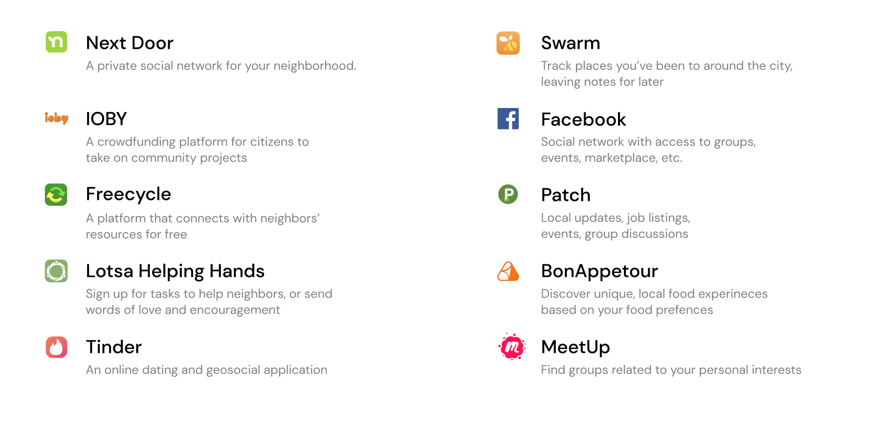
01. competitive analysis
We began by conducting a competitive analysis of a myriad of existing, community building platforms. Ultimately, we found a large amount of existing apps catered toward very short time residents or travelers, as well as a lot catered toward permanent residents who already feel established and comfortable in their neighborhood. Though we found a few solutions aimed at new residents, we found that these tended to be very unnatural and largely inactive.
02. primary research
After conducting some basic desk research on relocation, new grads, and their intersection, we engaged in primary research. We found 16 relocated participants who have graduated within the last two years to interview.
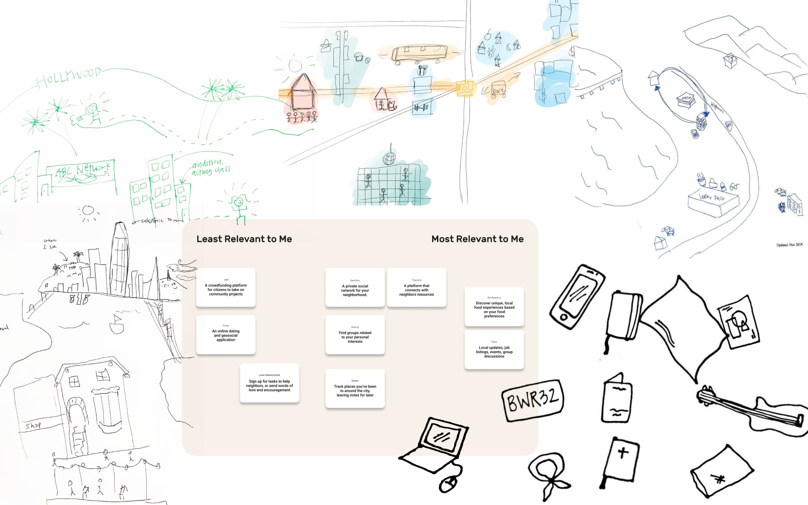
We created a strict outline for each interview as follows: 1) a 30 minute interview highlighting their experiences/expectations before, during, and after transitioning, 2) a directed storytelling exercise asking them to tell a story about a new friend they have met in the city, 3) a personal inventory method asking them to describe an object that has helped them transition, 4) a drawing exercise tasking them to draw their city, how they interact with it, and what that says about their relationship to it, and 5) a card sorting exercise to get their opinions on how relevant exisiting platforms are to them.
03. Synthesis
Once we had collected all of the responses from our interviews, we started the synthesis process. We compiled all relevant data onto digital sticky notes and arranged them into general themes. From there we collected a huge pile of insights.
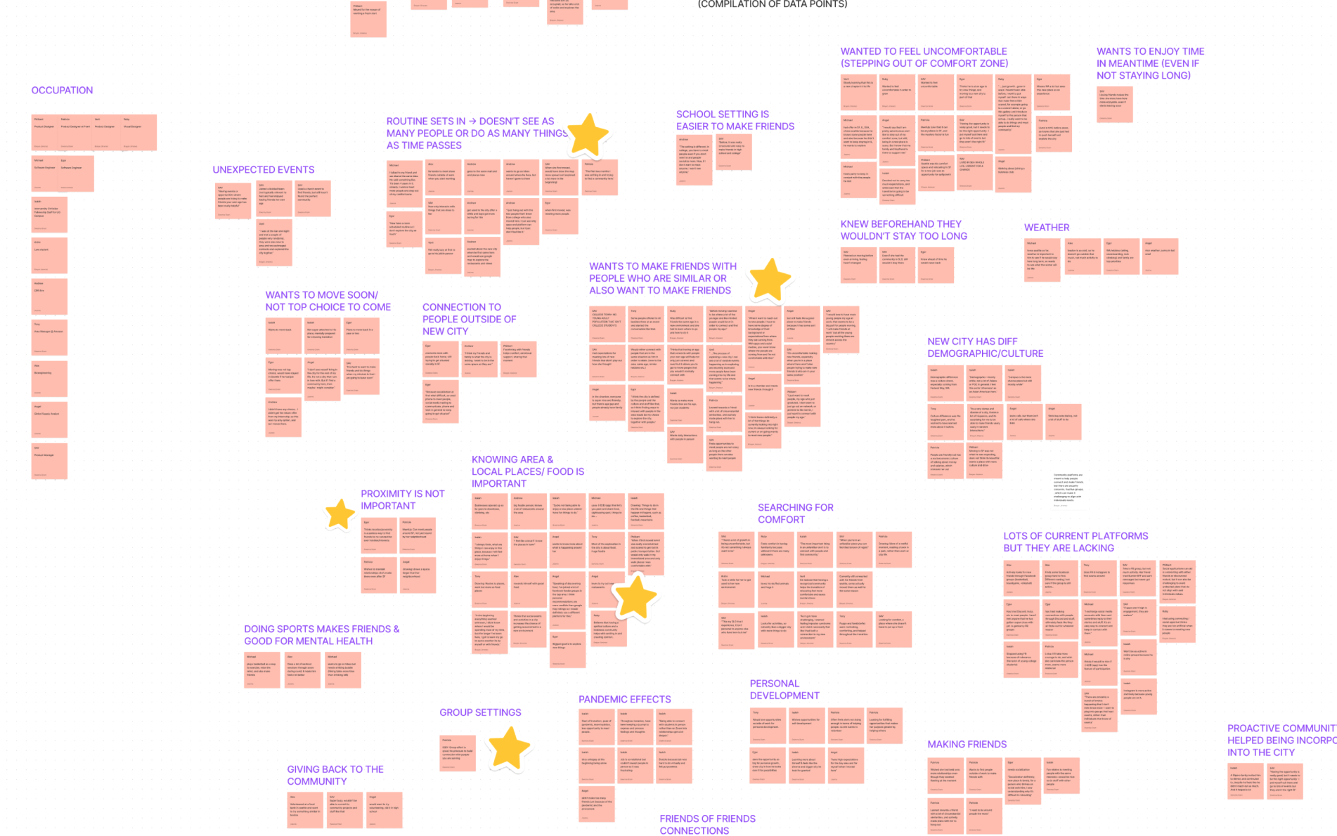
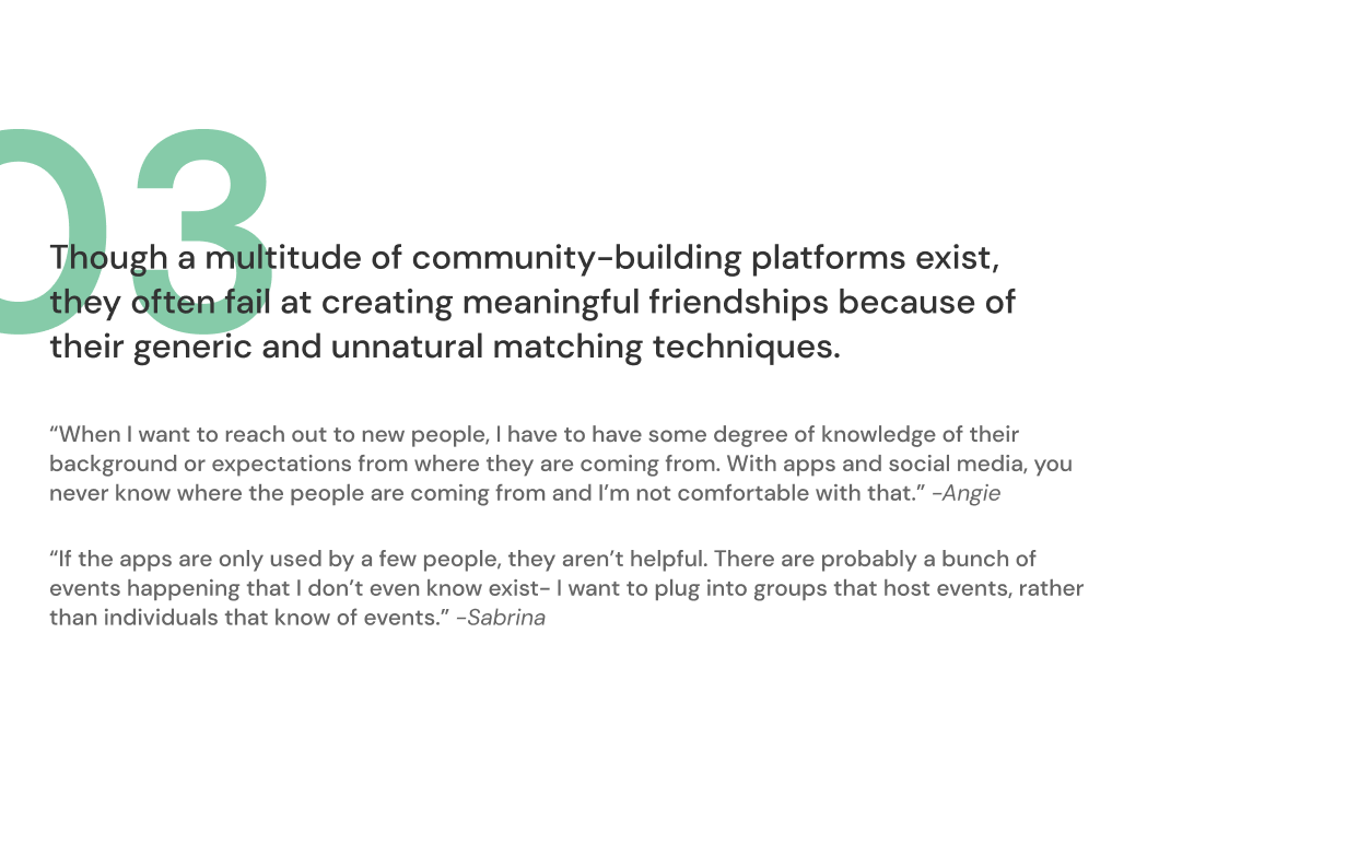
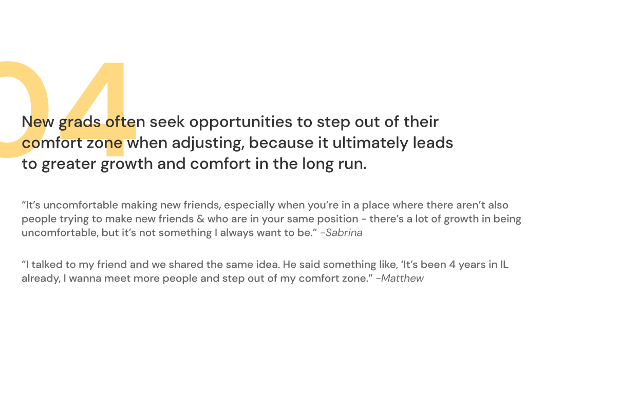
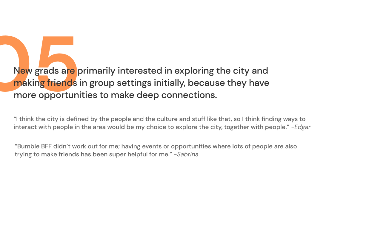
04. final research insights
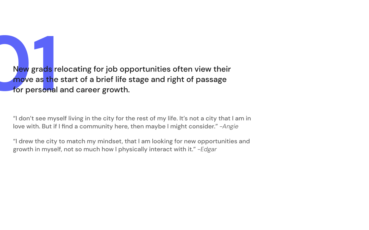
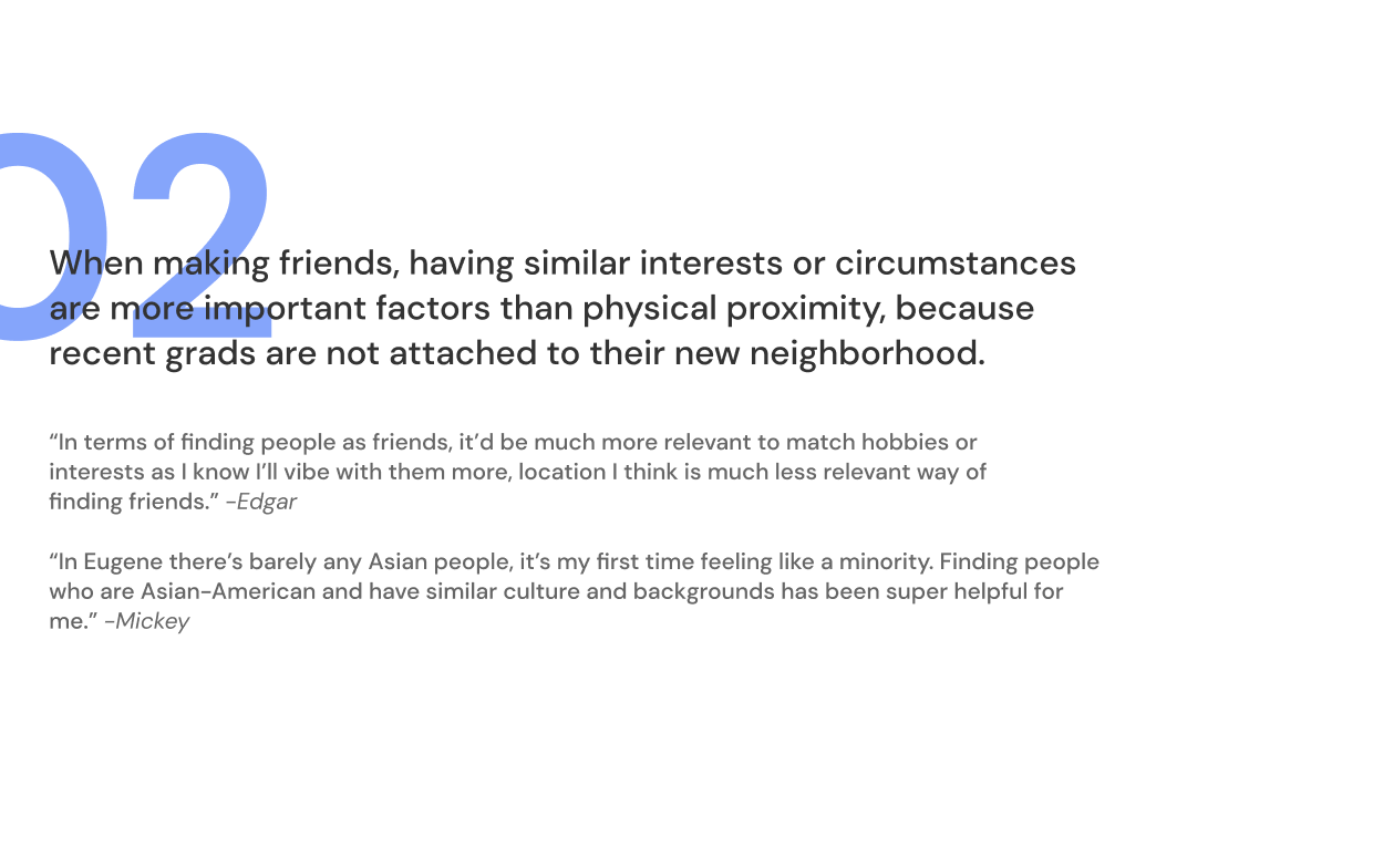
These 5 insights that were narrowed down were the most relevant to our background research, and correleated with the findings we had from our participants. This also helped with further developing the project and creating our design principles.
(Use right arrow to look at all 5 insights)
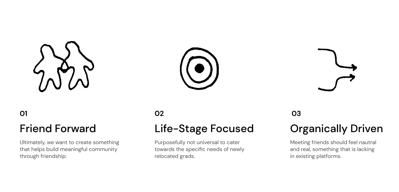
05. design principles
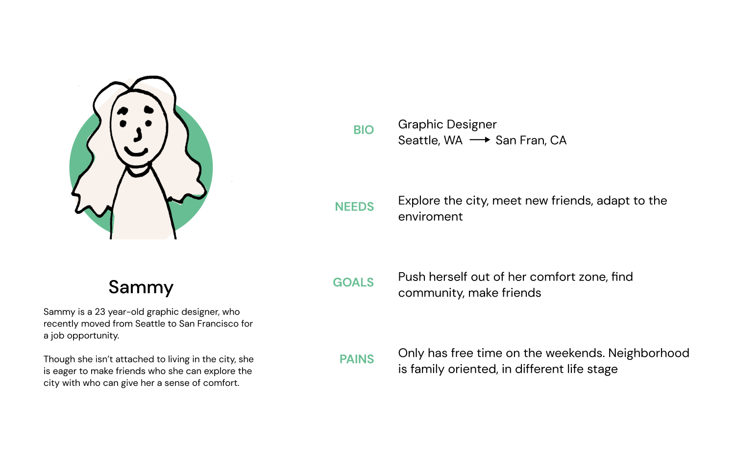
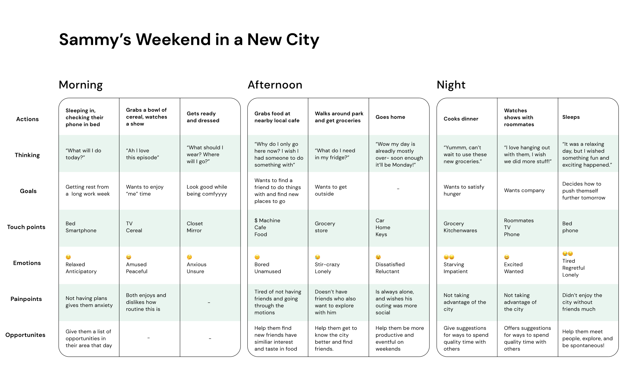
06. ideal persona & Journey map
With our design principles, we engaged in sense-making activities to help us better understand how our insights applied to our users. We created an ideal persona based on direct quotes from our interviews, and used that to make a journey map of a typical weekend day as inferred by their responses.
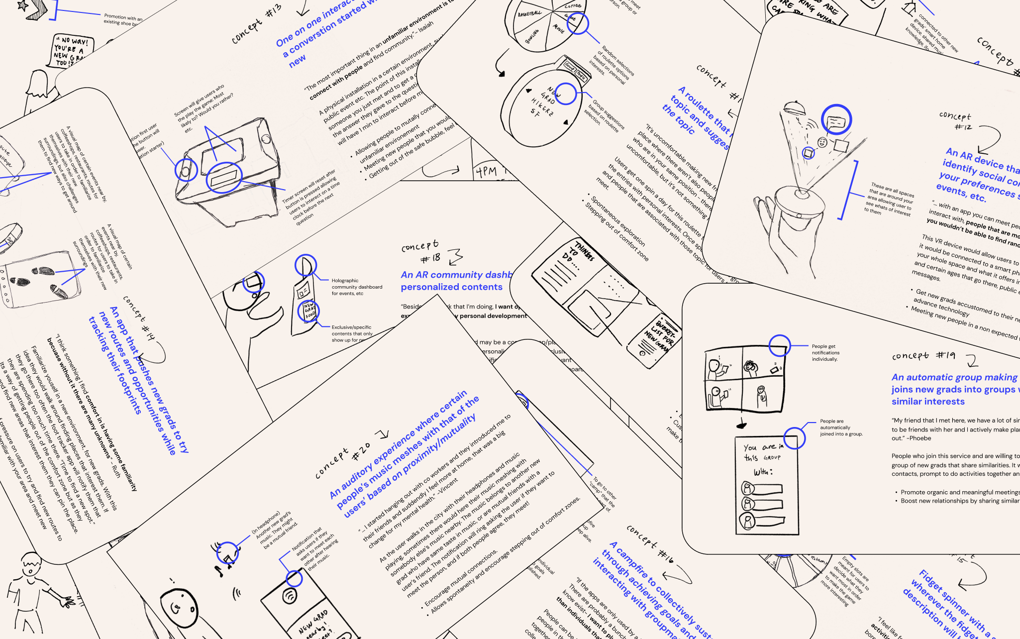
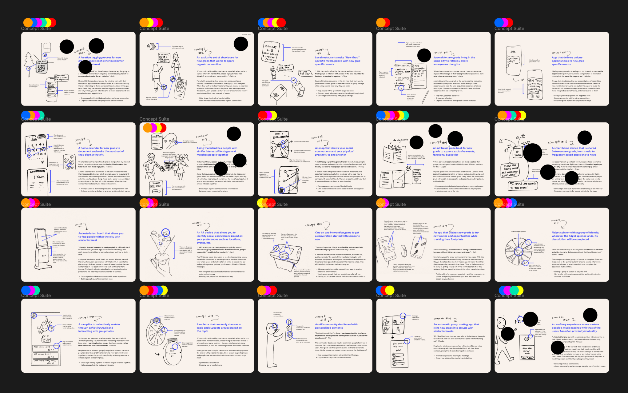
07. ideation process & down selection
We participated in both the 8x8 and 2x2 ideation methods to accumulate our top 20 ideas.
We then started the down-selection process using two primary methods. We first labeled all of the ideas with colored dots representing how each idea lined up with our design principles and insights. After, we did simple dot-voting to see which ideas each of us were most intrigued by and felt best lined up with our problem space.
(Use right arrow to see next slide)
08. Version 1 & 2 ideation outcome
After, we heavily discussed our top ideas and ultimately decided on the final one we wanted to pursue. With it, we decided to make a low-fidelity prototype for user testing. We came up with two slightly different versions, as there were some features we were unsure about. We had participants walk through both flows, talk about their experience using them, and indicate which version was best and why.
With all of that, we ended up pursuing a concept very similar to the first of the two versions. On top of it being most favorable when compared to participant quotes, we felt it best reflected our design principles and desired outcomes.
Version 01
Version 02
09. user testing
After conducting research with our participants, we discussed our findings and compilied them to determine features we want to stick with and change. some of the findings included, ID verification for user safety, enhancing home screen etc. Ultimately, we felt the first version (physical exploration of tags) addressed our insights and design principles best, but found positive elements in the second version (map of tags) as well.
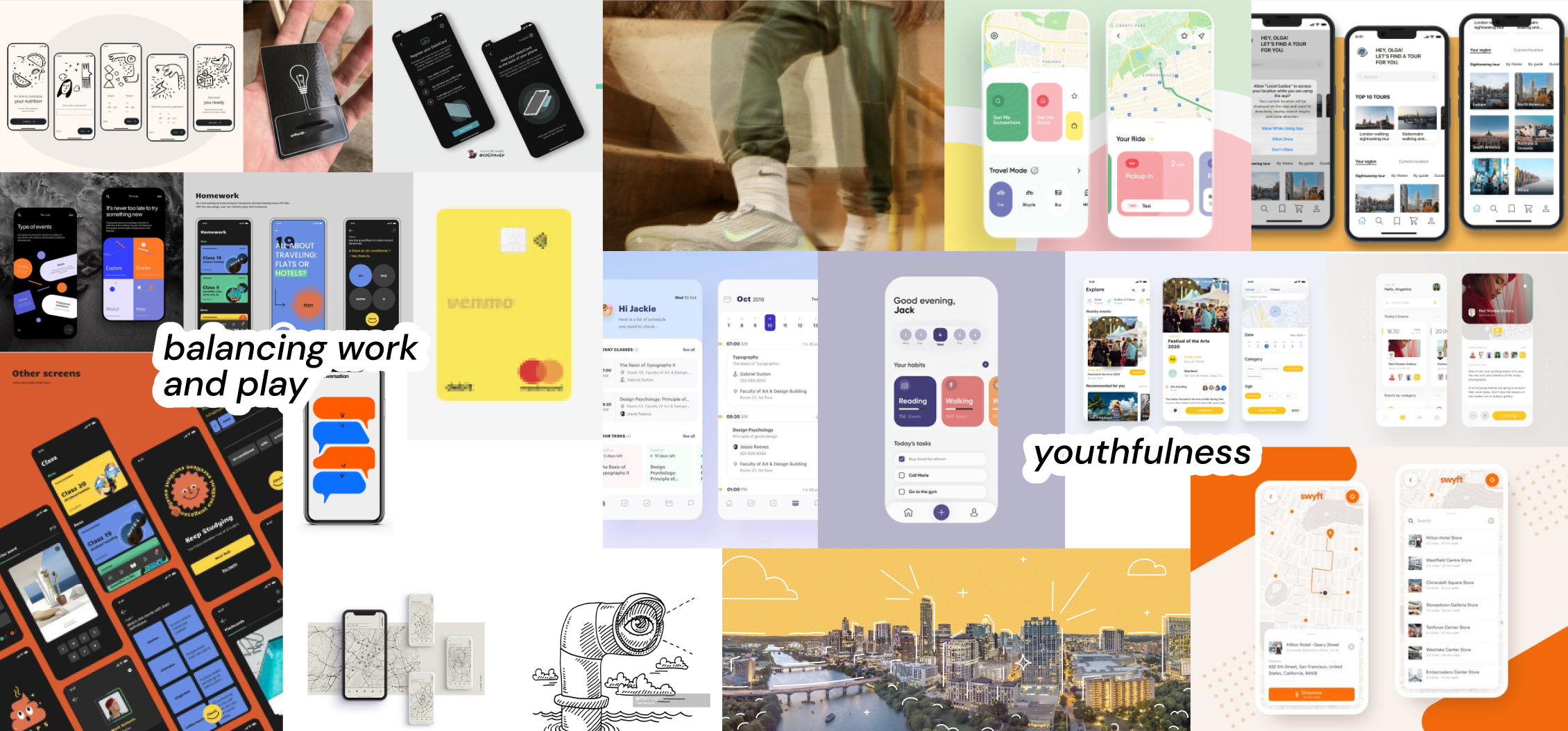
10. mood board & ui exploration
After user testing and compiling the successes and shortcomings of our prototype, we started to ideate the look and feel of our system. We first created a mood-board of inspiring UI. Once we decided on the style that was most compelling to us, we individually ideated different flows for the companion app. Finally, we spent time ideating how the NFC sticker could look for visibility and quick digestibility.
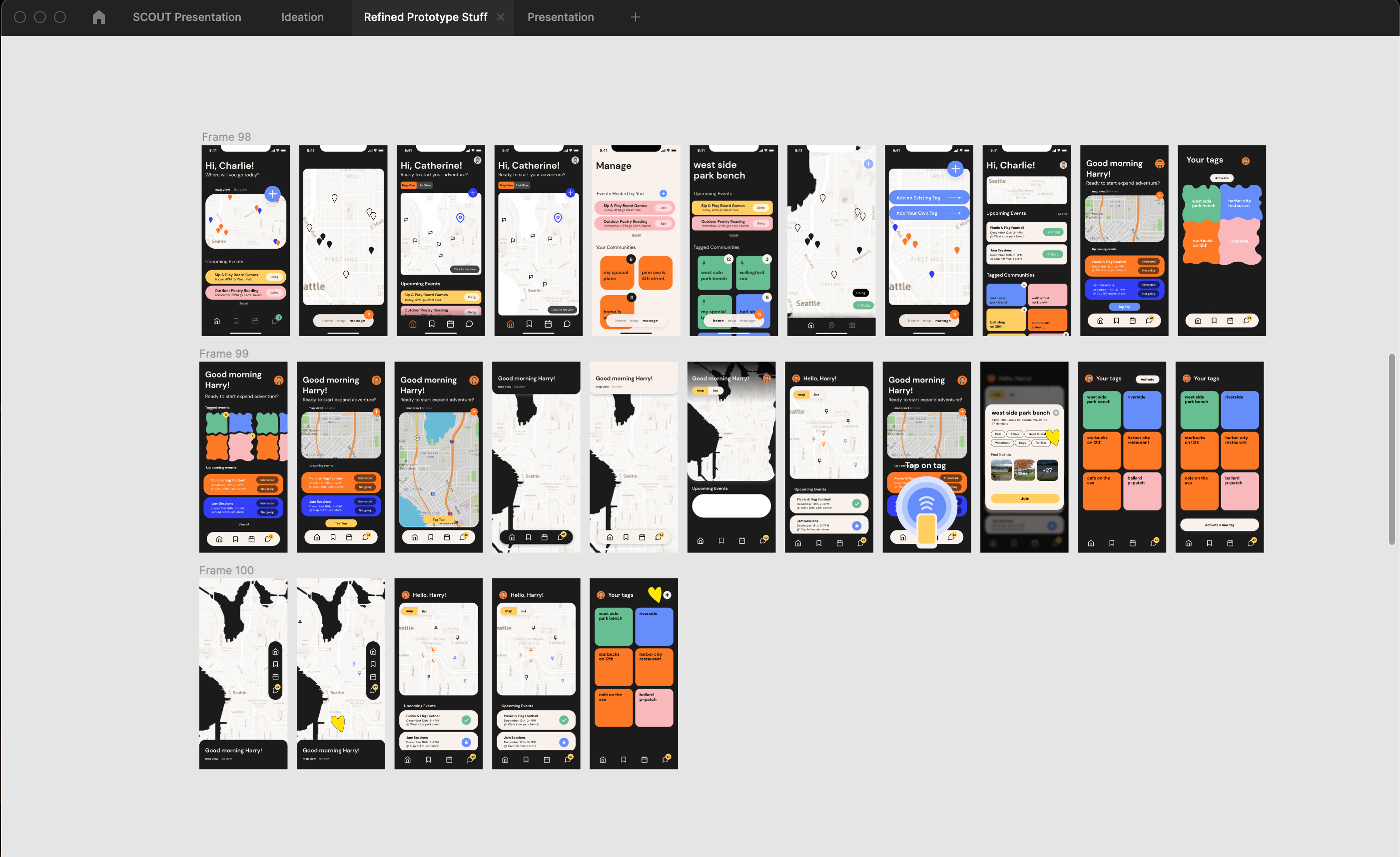
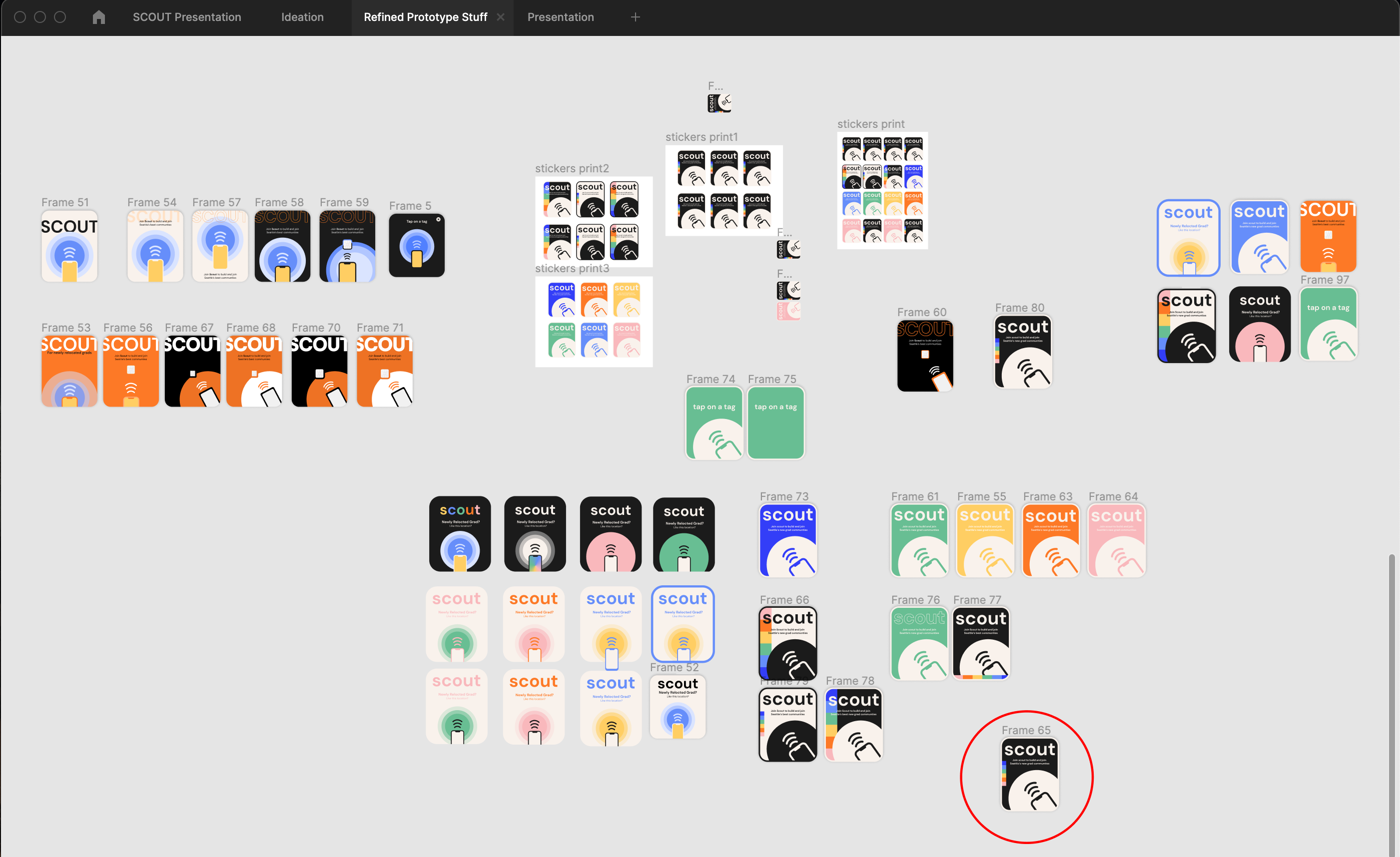
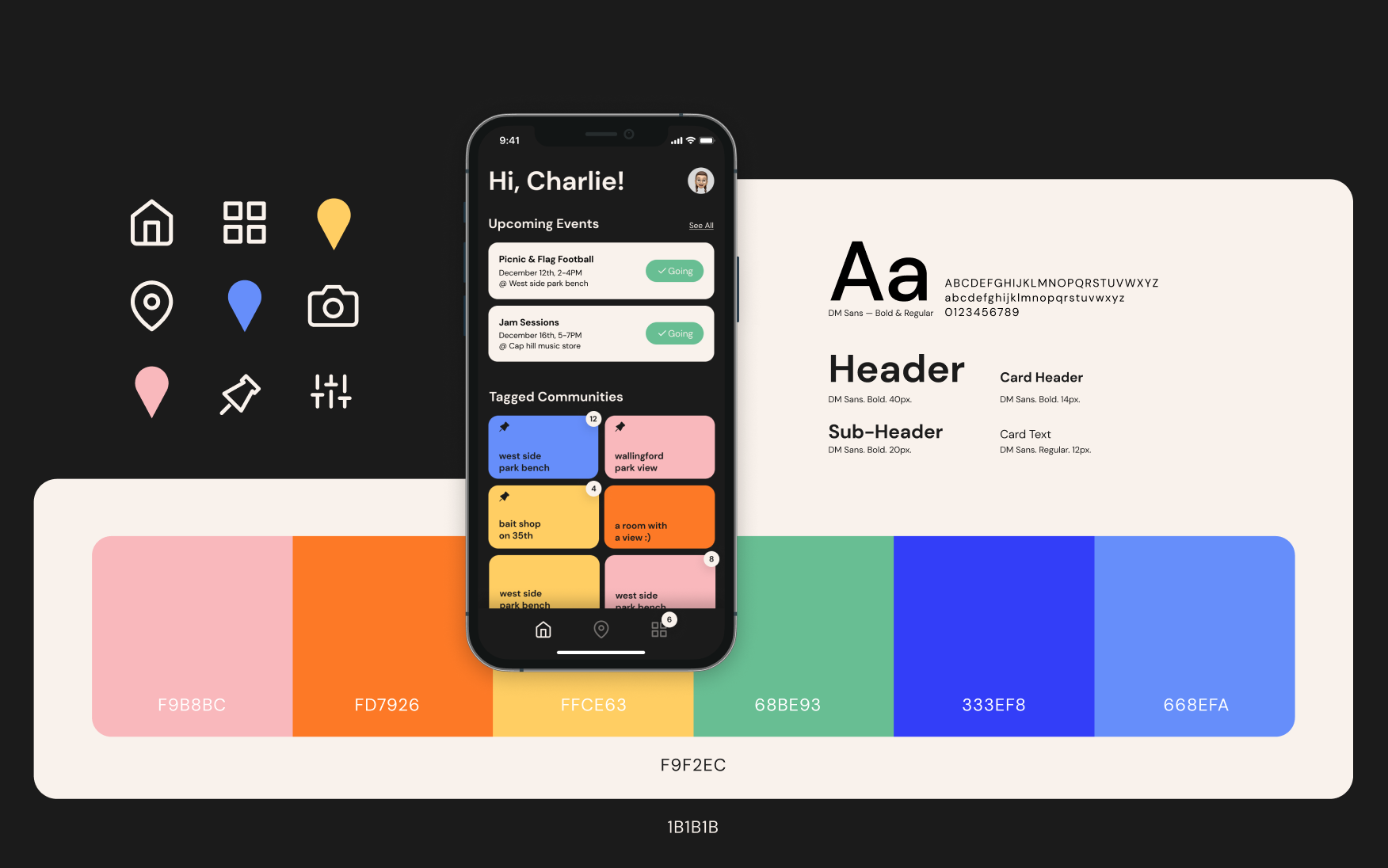
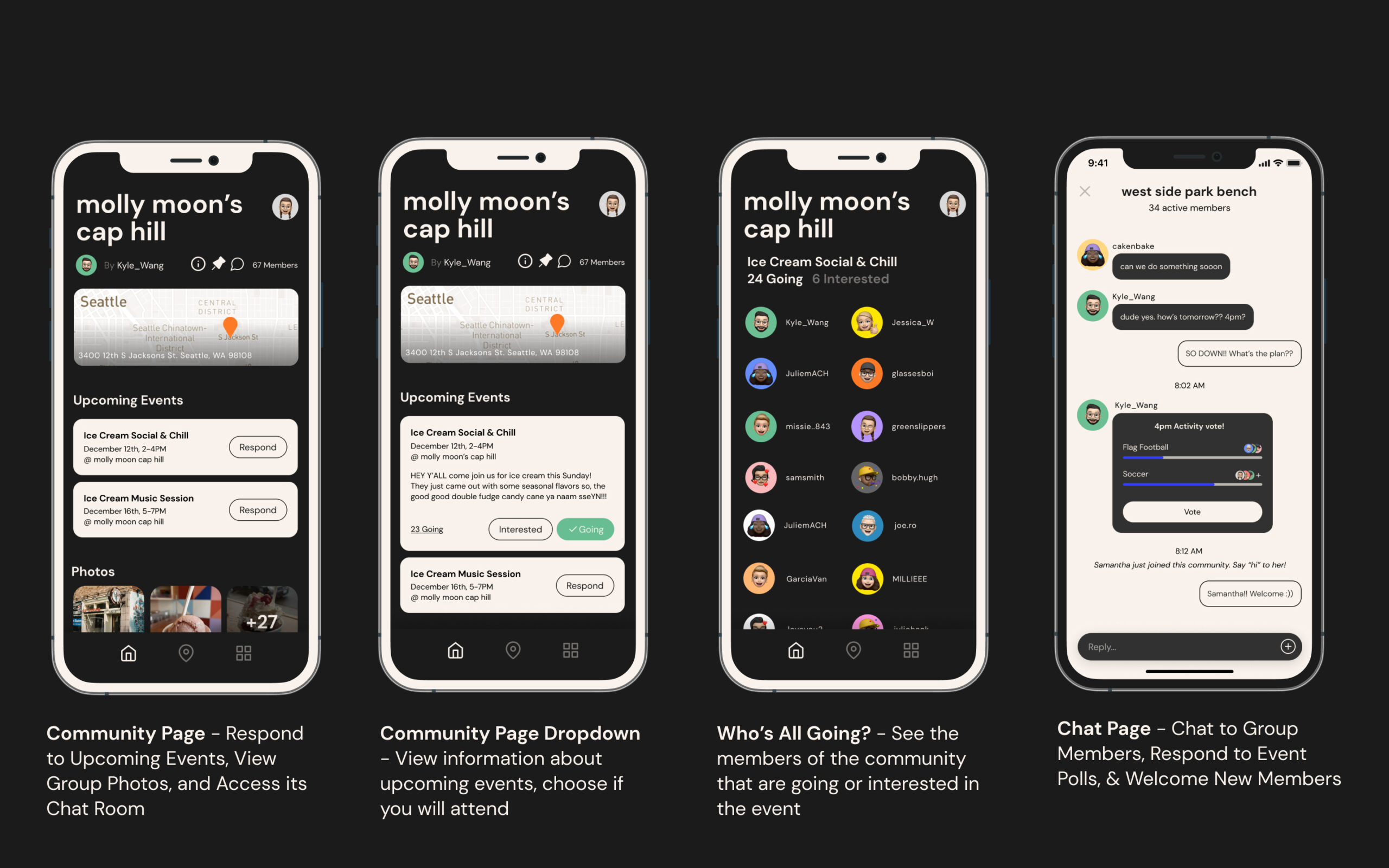
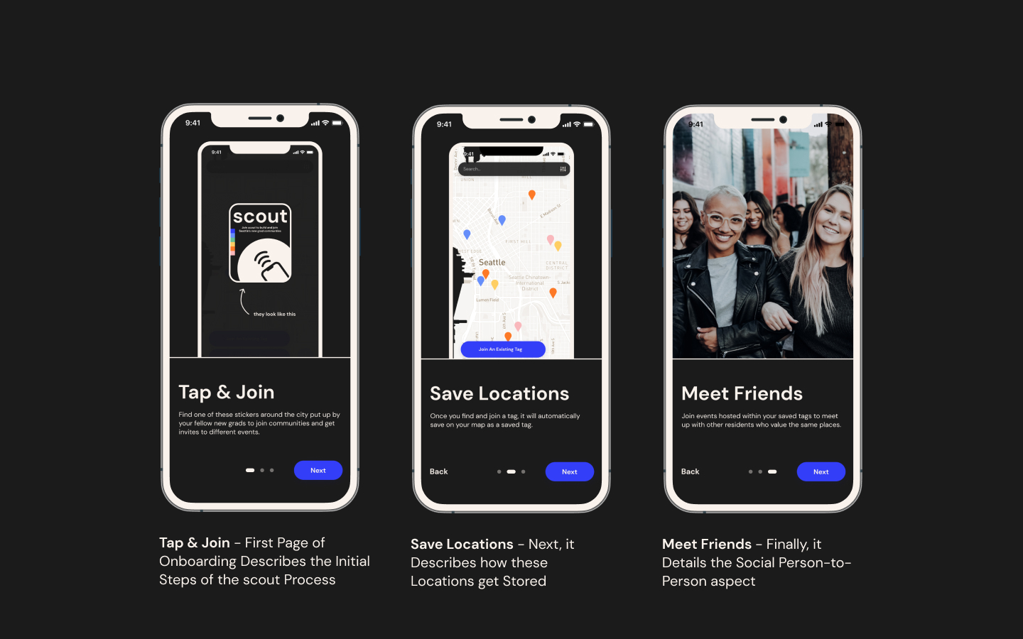
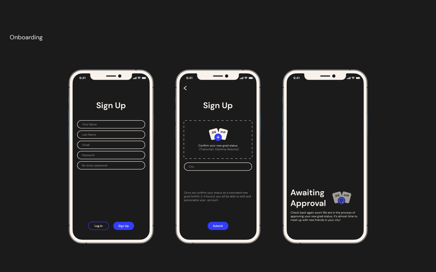
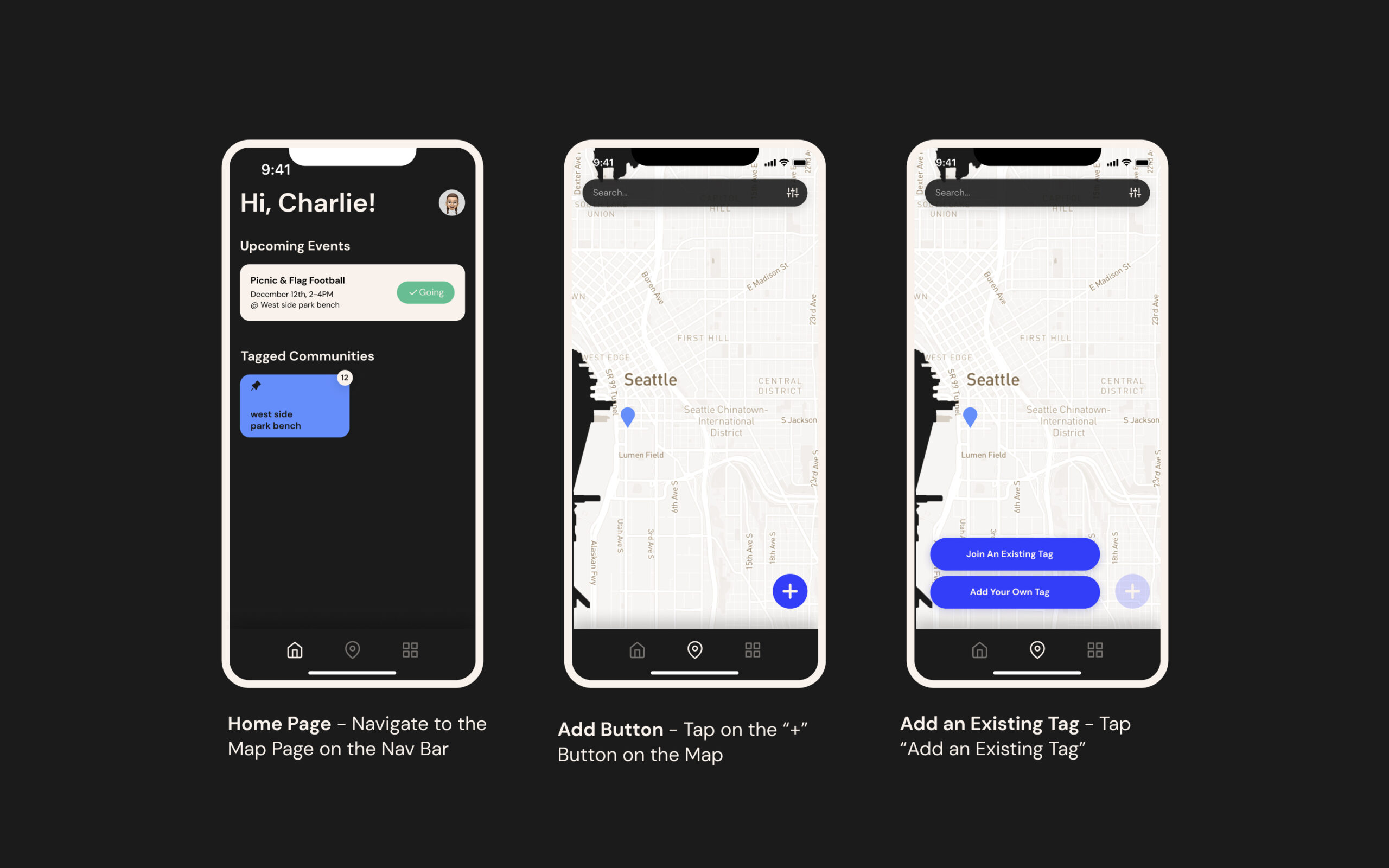
11. final prototype design
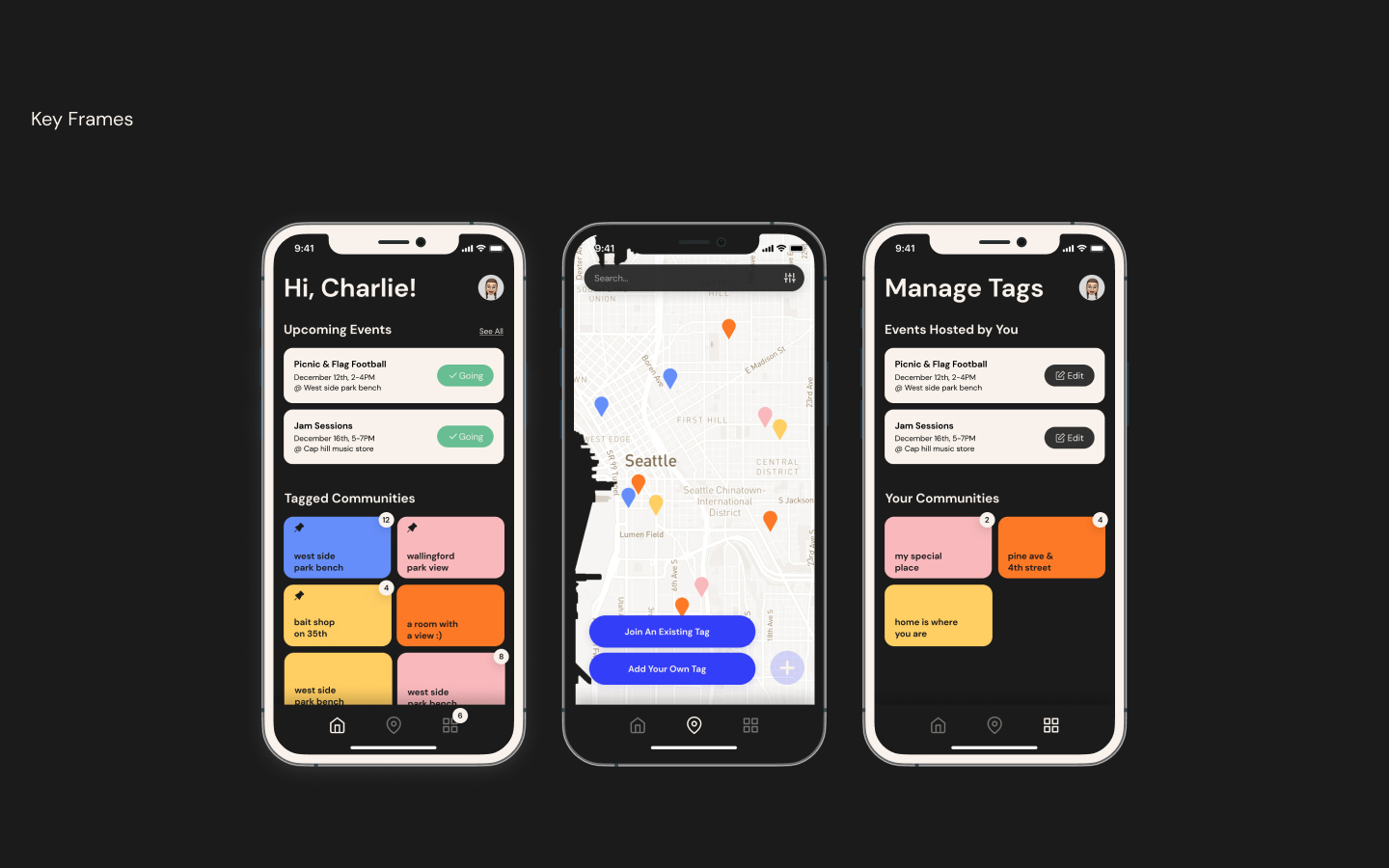
Finally, we created our refined prototype! We created design language for our system, fleshed out the microinteractions using Figma, and compiled the full suite of flows and key frames. Lastly, we created a video storyboard of our concept in action.